
Background
Administrate is a Training Management System for in-house L&D enterprise teams and corporate training providers. In 2022, the company had well out-grown its visual identity. It needed to identify itself as a challenger brand in the Learning Tech space.
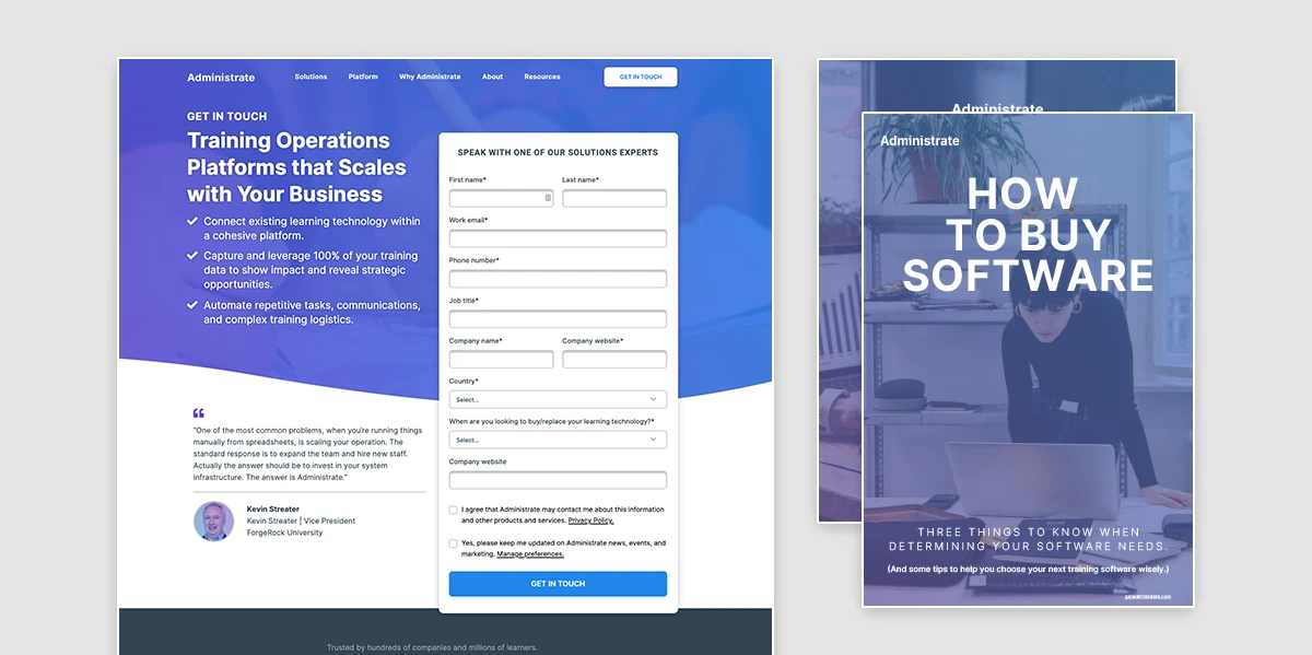
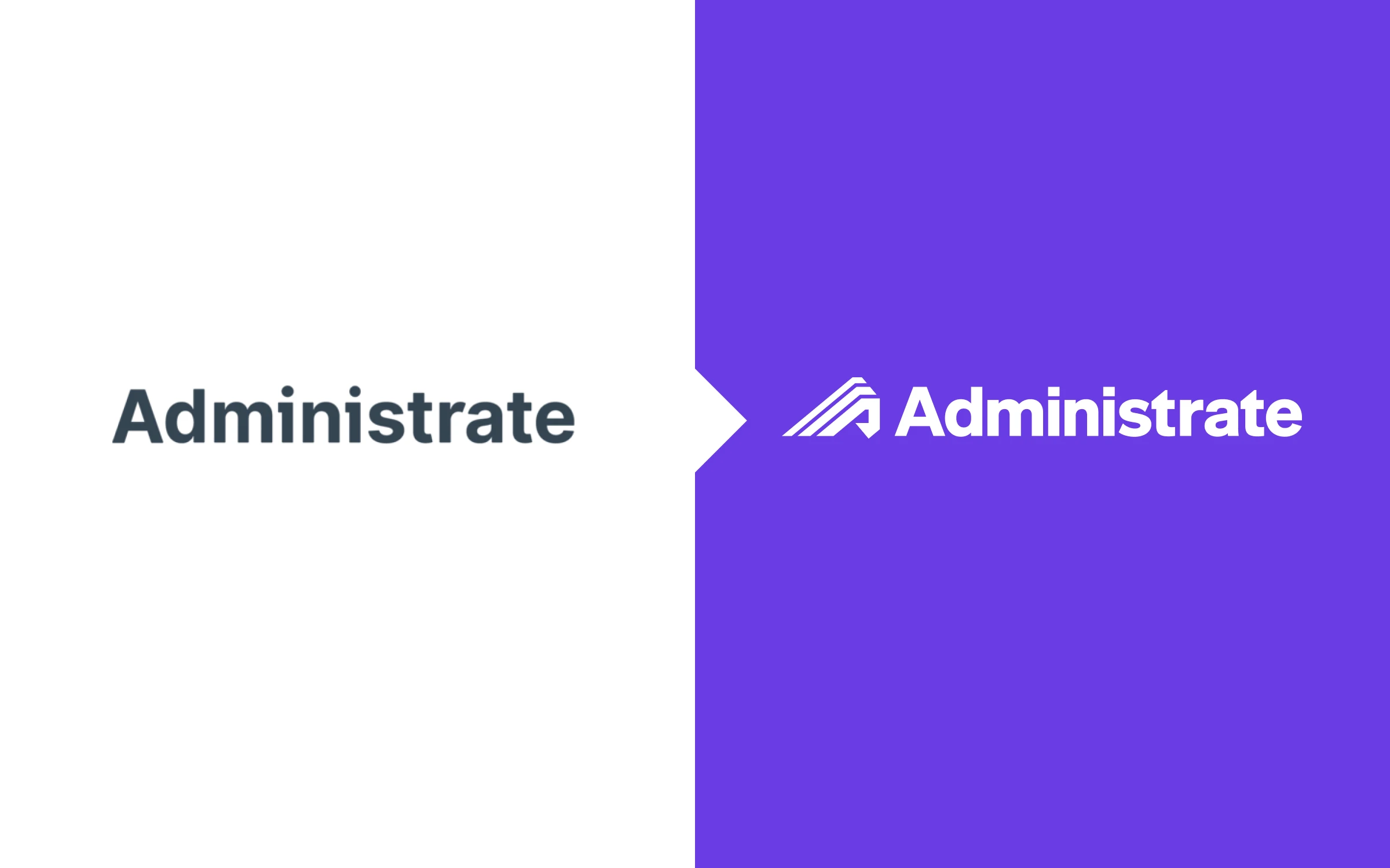
Old logo and visual identity applied. The previous full logo next to the one I designed.
The problem
The old visual identity and logo had gotten Administrate this far, but there were some significant limitations:
- Lack of distinguishing features. The typeface used for the visual identity was the popular Sans Serif, Inter, with tweaks to letters in the full wordmark. However, when represented in small spaces like social media avatars or even t-shirts, the brand was often represented by a capital “A”, making it virtually indistinguishable. One employee even described its usage on t-shirts as reminiscent of Alvin and the Chipmunks.
- Generic corporate visuals. Stock imagery, product illustrations, and templates for assets and the website didn’t feel united in style, nor particularly unique to the company.
- Inconsistent branding and incomplete documentation. When I started, there was a brief branding document and folder of basic assets. Many folks at the 50-person company needed more assets and clear direction in order to create new, enterprise-ready tools, slidedecks, and programs.
My role and approach
As Creative Director and sole creative on this project, I was responsible for:
- Facilitating executive stakeholder workshops to define brand personality.
- Leading all visual identity development from concept to final execution.
- Creating comprehensive brand guidelines and asset libraries.
- Coordinating rollout across all company functions.
- Designing and implementing applications across digital, print, and event touchpoints.
The challenge was clear: deliver agency-quality work in-house while ensuring genuine stakeholder buy-in and company-wide adoption.
Creative direction
The big idea: Transform Administrate from a functional training tool into an authoritative challenger brand that embodies progress and unification.
The brand refresh needed to accomplish three things simultaneously:
- Distinguish Administrate in a sea of blue-branded tech competitors
- Unite the visual language across all touchpoints with clear, implementable systems
- Elevate perceptions from mid-market solution to enterprise-ready platform
Strategic choices:
- Purple as primary brand color - Differentiate from blue-heavy competitors while signaling innovation and leadership.
- Asymmetrical logomark - Create memorable, distinctive mark that works at any size (solving the “generic A” problem).
- Upward motion - Three beams meeting at the center to symbolize unification and progress.
- Branded house architecture - Build recognition with the new mark rather than fragmenting with separate product identities.
Every visual decision connected back to making Administrate feel like the authoritative, daring, reliable partner that our stakeholder workshops revealed we needed to be.
Redesigned Administrate logo.
Stakeholder involvement
In addition to building best-in-class software, Administrate has strong values. I wanted to ensure that visual and written expressions of the brand were faithful to company culture.
Approach
I conducted internal and external brand interviews with stakeholders across the company:
- What makes Administrate unique?
- What do our customers need? (Consider: what the customer wants, the problem we’re helping them solve, and what life will look like after they engage with us.)
- What do we offer that the competition does not offer?
- Describe Administrate in 3-5 words.
- If Administrate were a celebrity, who would it be and why?
The questions were all getting at the same thing, both allowing the interviewee time to become comfortable engaging in an abstract exercise and to account for different communication styles.
I facilitated a Brand Personality workshop with the full leadership team and C-suite. Team members were globally located in Scotland, Ireland, Montana, Chicago, and Georgia, so I led the meeting over Zoom and kept it to thirty minutes. To prevent groupthink, I started the call with a brief introduction to the exercise and then asked them to privately ascribe Administrate personality traits on a Likert scale. A long-time favorite became the Champagne vs. Beer example, à la “If Administrate were a person, would you offer them a beer or champagne?”
Results and impact
The rebrand exceeded expectations and delivered measurable business impact:
Market positioning:
- Successfully positioned Administrate as enterprise-ready for North American markets.
- Sales and trade show teams reported significantly higher brand recognition from prospects.
- Trade show foot traffic increased notably with the new visual identity.
Internal adoption:
- Comprehensive rollout package ensured immediate, consistent implementation across all teams.
- New visual identity received enthusiastic internal response, with employees actively requesting branded materials.
- Brand guidelines became the go-to resource for all creative work.
External validation:
- Network colleagues repeatedly asked leadership for referrals to the “agency” used for the rebrand—it was a one-person internal team.
- Partners and customers responded positively to the refreshed, more confident brand presence.
- The new visual identity has supported the company’s traction with enterprise prospects and partners.
“Alex joined my team as Creative Director at a time when the Administrate brand needed to be leveled up to its new North America/enterprise target market. With exceptional process and design skills, she guided the organization’s executive, product, and commercial teams through a comprehensive consideration journey toward what is now the logo, accompanied by a full brand kit and style guide. After its launch, I was repeatedly asked by network colleagues for a referral to the ‘agency’ we had used for our rebrand. It was a one-woman shop: Alex created it, top to bottom.”
— Katherine Krause, VP of Marketing at Administrate
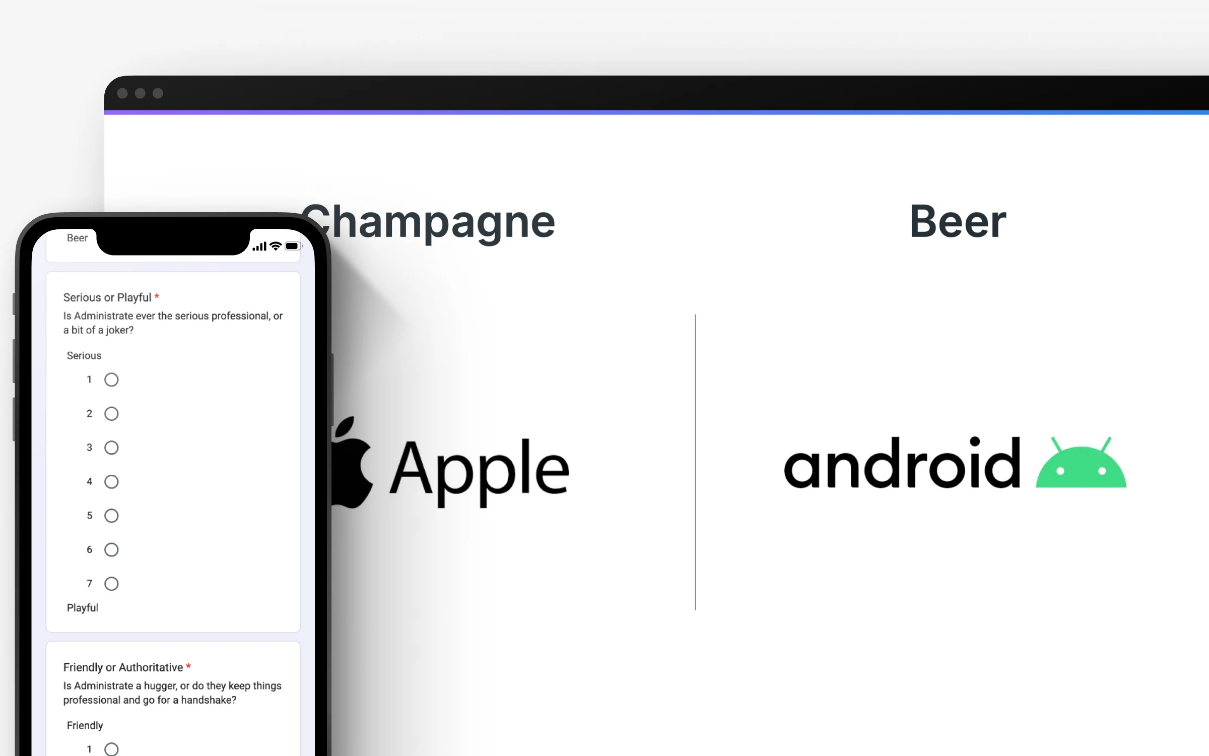
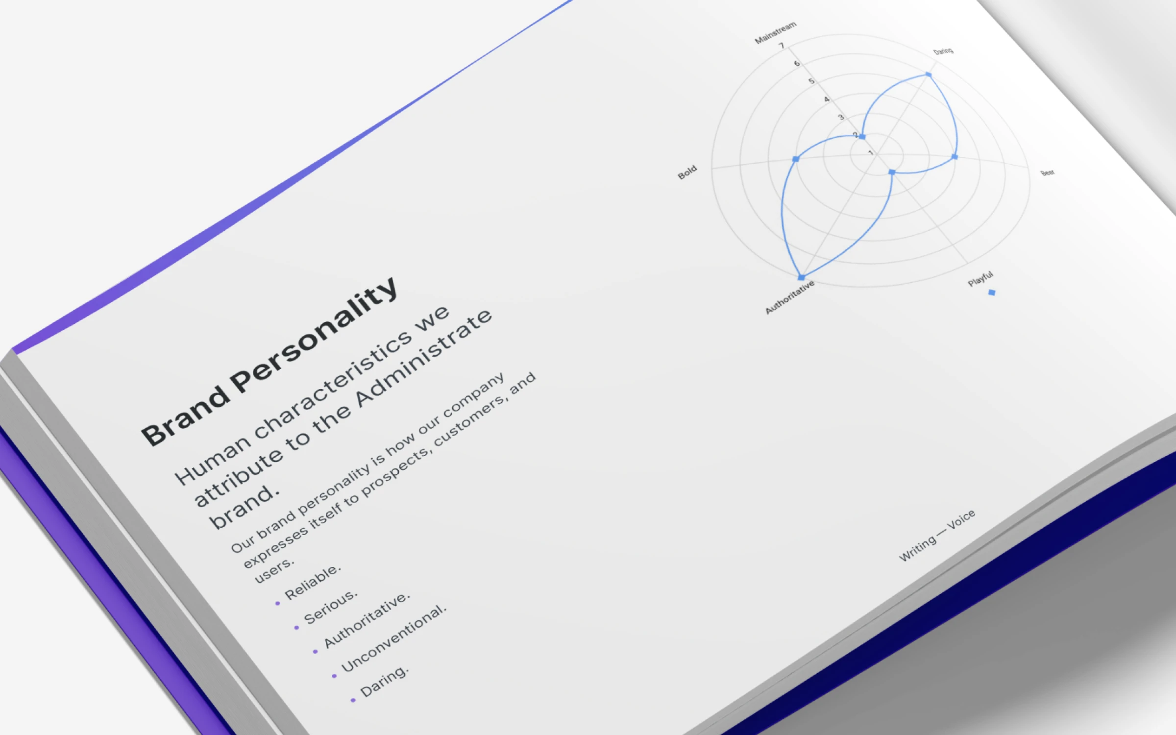
Screenshot of the form that executive stakeholders filled and resulting data.
From this exercise, we landed on traits that later even went in our branding guidelines, the three most important being:
- Reliable
- Authoritative
- Daring
The exercise proved useful: stakeholders took an active role in developing the brand and got a window into what visually representing a brand would entail.
Brand identity development
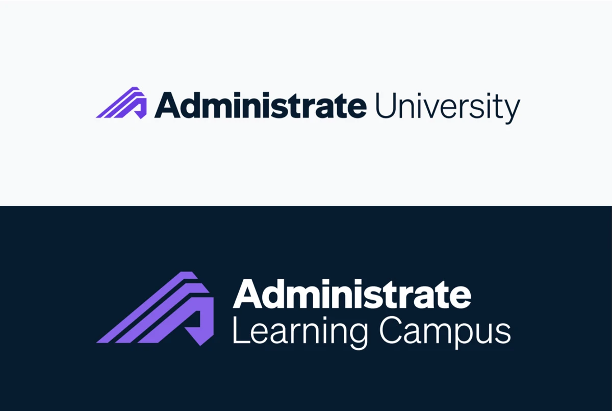
The new logo is a combination trademark with an asymmetrical symbol based on the first letter of the brand name. The letter “A” is made up of three light beams that all go up and towards the center of the letter, emphasizing the company’s commitment to progress. It marks a significant departure from our old emblem, which was a static letter set in the primary brand typeface, Inter.
Why this direction won: During concept development, I explored multiple directions—including more conservative evolutions of the existing mark. The asymmetrical beam concept stood out because it:
- Solved the “generic A” problem with a truly distinctive form
- Told our story (unification, progress, forward momentum)
- Worked beautifully at any scale, from social media avatars to trade show signage
- Felt fresh in a category dominated by safe, symmetrical wordmarks
The bolder direction aligned with our “daring” brand personality while the refined logotype kept it grounded and professional.

Logomark in different colorways, showing the inverted purple that was developed for brightness against dark backgrounds.
The three stems of the abstracted “A” in the logomark shoot up and to the right, meeting in the center and symbolizing how Administrate unifies training systems, functions, and tools.
The logotype uses Söhne, with some subtle customizations. Söhne’s tight spacing, low contrast, and humanist qualities temper the bolder logomark.
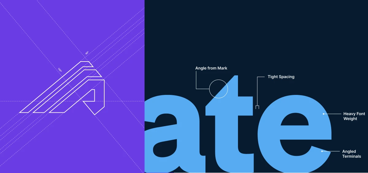
Details from the construction of the Administrate mark and logotype.
Brand architecture and subbrands
Prioritizing developing recognizability in our market with the new mark, we also moved forward with a branded house approach for subbrands and products. You can see how this played out for our customer and employee training in the Administrate University case study.
Color palette
The most strategic visual shift was moving from blue to purple as our primary brand color—a bold choice in a category where nearly every competitor uses blue. I adjusted the core color to a richer, bluer core purple.
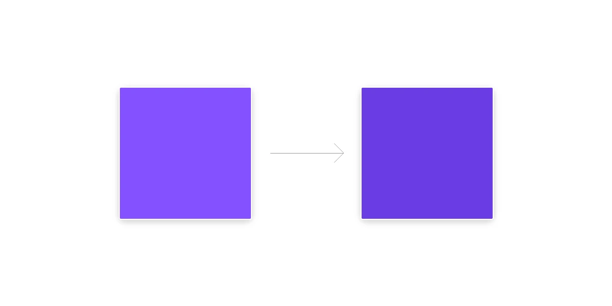
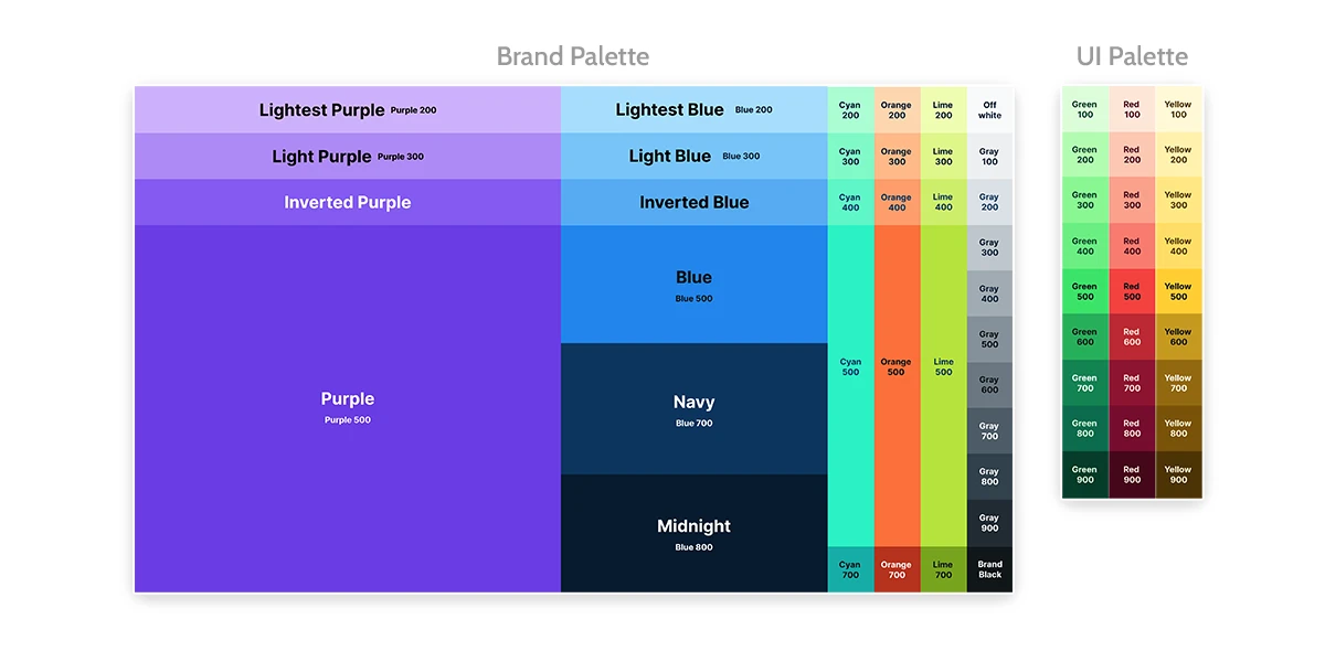
The purple brand color highlights Administrate’s role as a changemaker in the corporate training industry and differentiates Administrate from its competitors. Blue was shifted to a supporting role in the palette. A set of vibrant, supporting accent and semantic (for product UI) colors were also introduced to the palette.
Rollout and documentation
A detailed set of brand guidelines were developed in order to communicate the changes to the company and partners. I presented the changes internally, communicating the reason for the change as well as providing an overview of the thinking behind the adjustments.
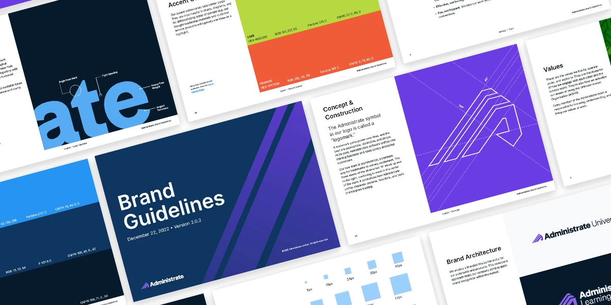
Significant attention was given to making the rollout as simple as possible for all relevant teams, and I made sure to send detailed emails alongside accessible assets to all relevant team leads.
This project underscored the importance of comprehensive research, a clear creative vision, early and frequent involvement of leadership, and rigorous implementation. The visual work here aimed to authentically capture the brand personality and values of the company.
Digital footprint
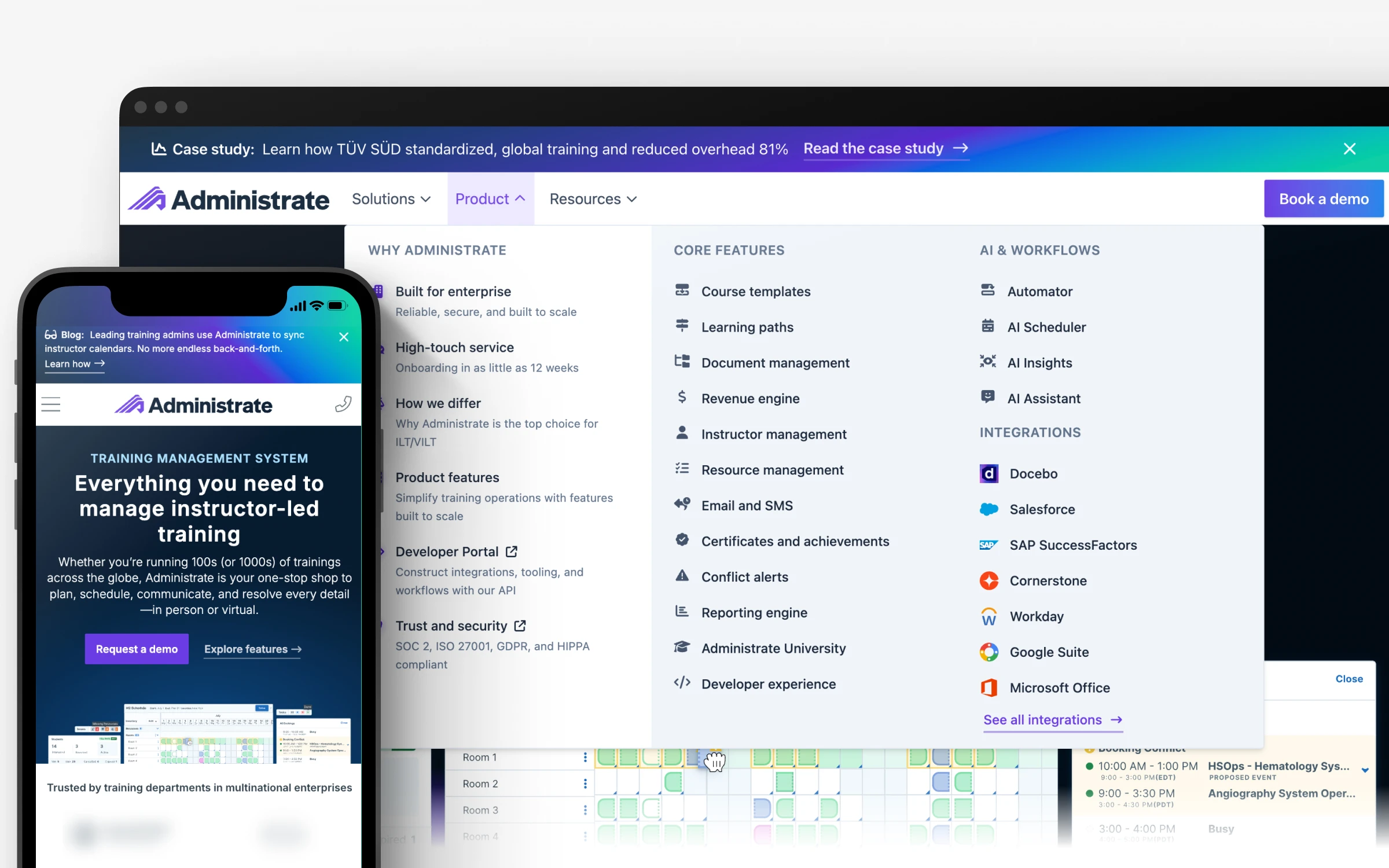
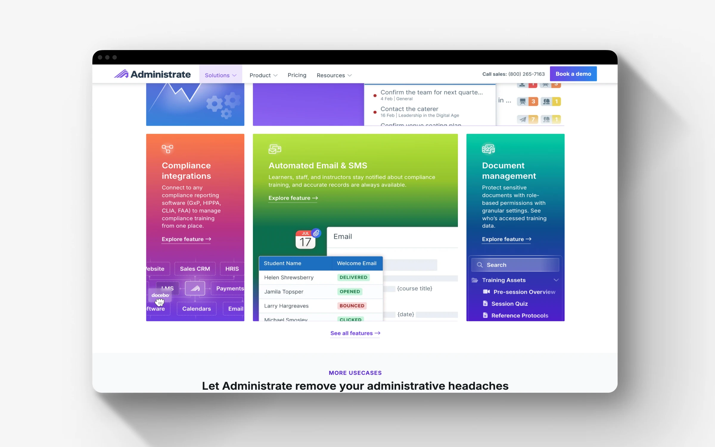
Our flagship marketing website went through significant updates in order to use the new palette and approach, now featuring custom illustrations, the new iconography, and much more product imagery - all of which I personally designed and validated with our Product team.
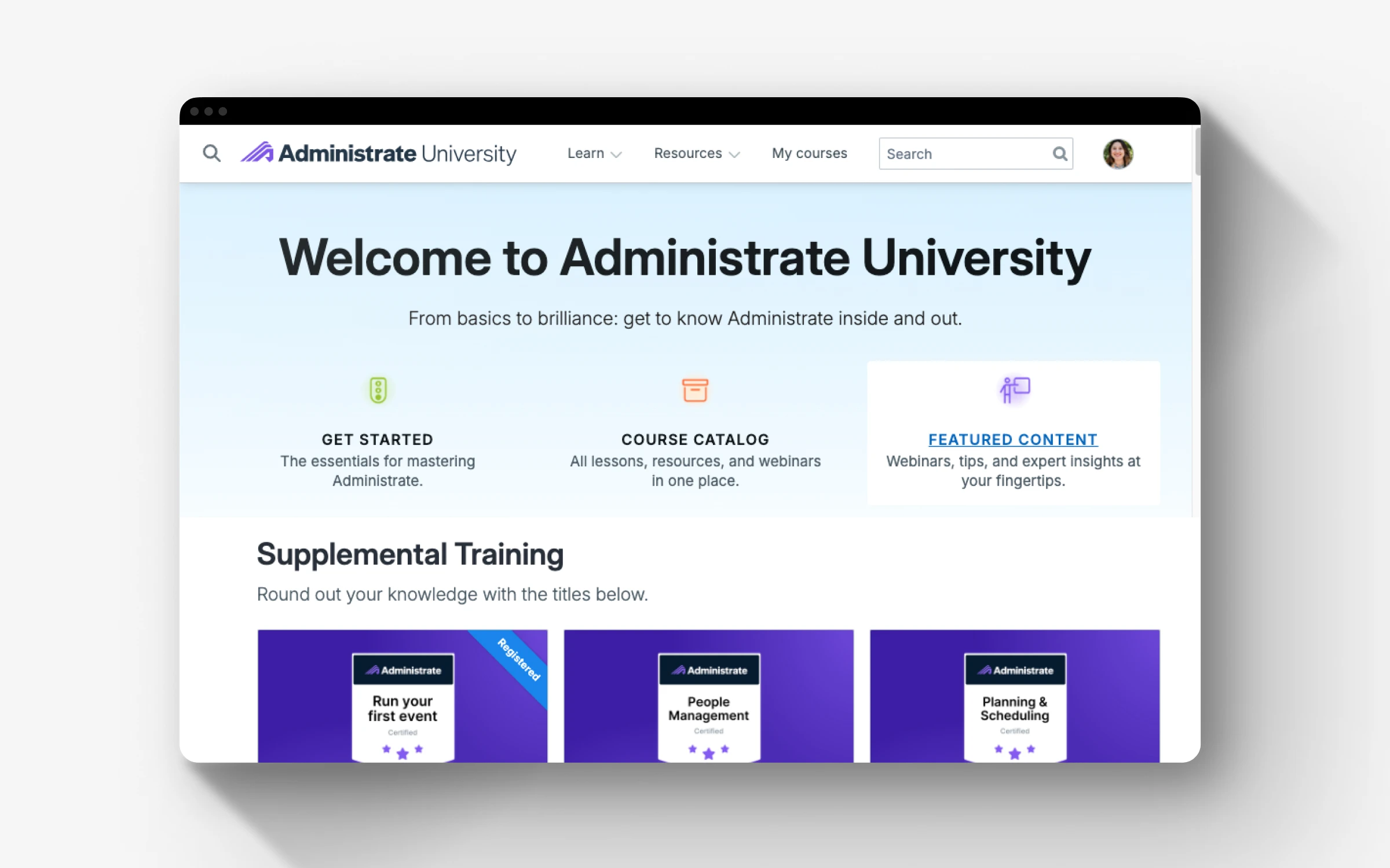
New brand applied to Administrate’s customer training.
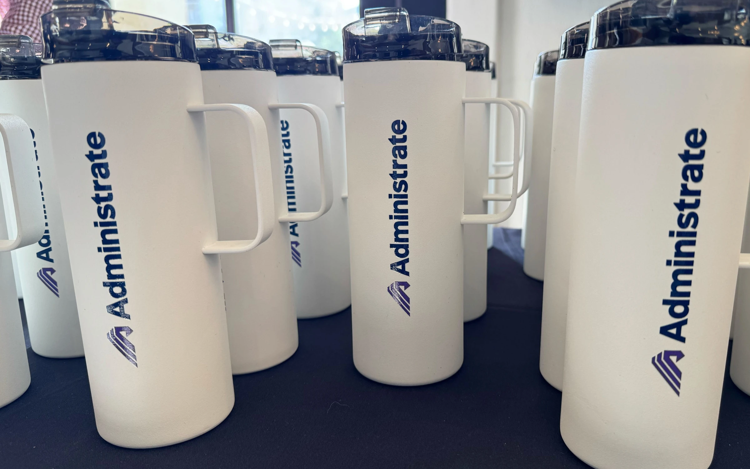
Our humble but beloved annual customer summit was also given a facelift in collaboration with our VP of Customer Success, and a more recognizable logo could be shared with Partners at their customer events.
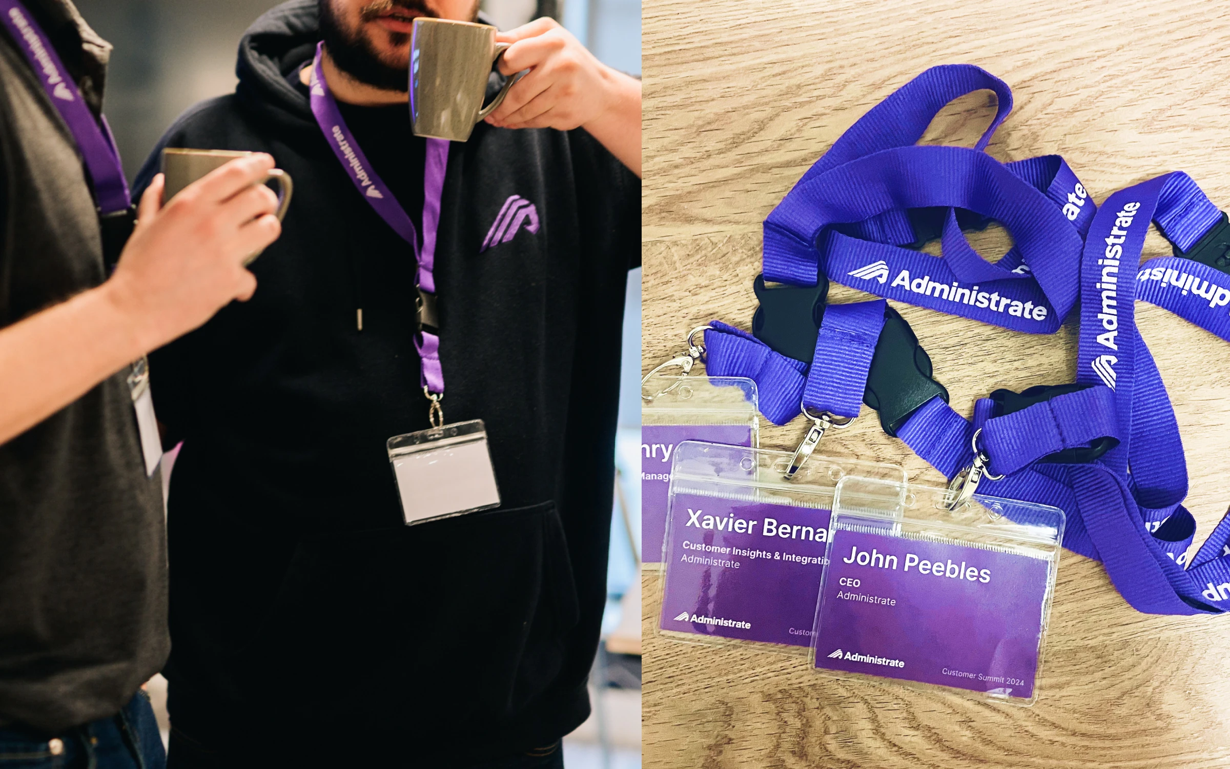
Employee gifts
We took the opportunity to sync with People Operations to provide employees and some key customers a new swag box with our branded materials. For many, this was the first time they had received any branded gifts from the company.
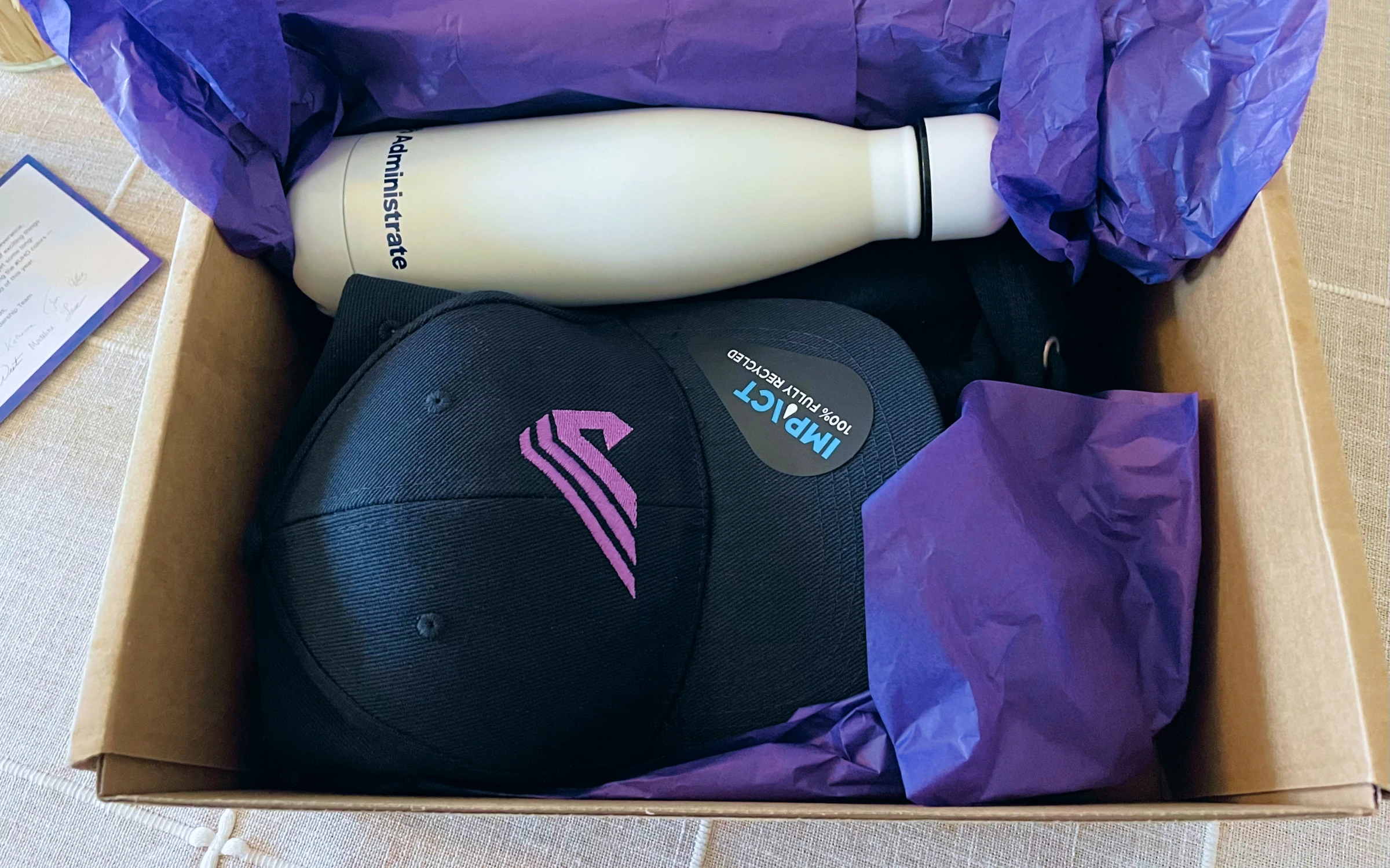
Photo of swag box given out to all existing employees, some key customers and partners, and new hires.
Sales enablement
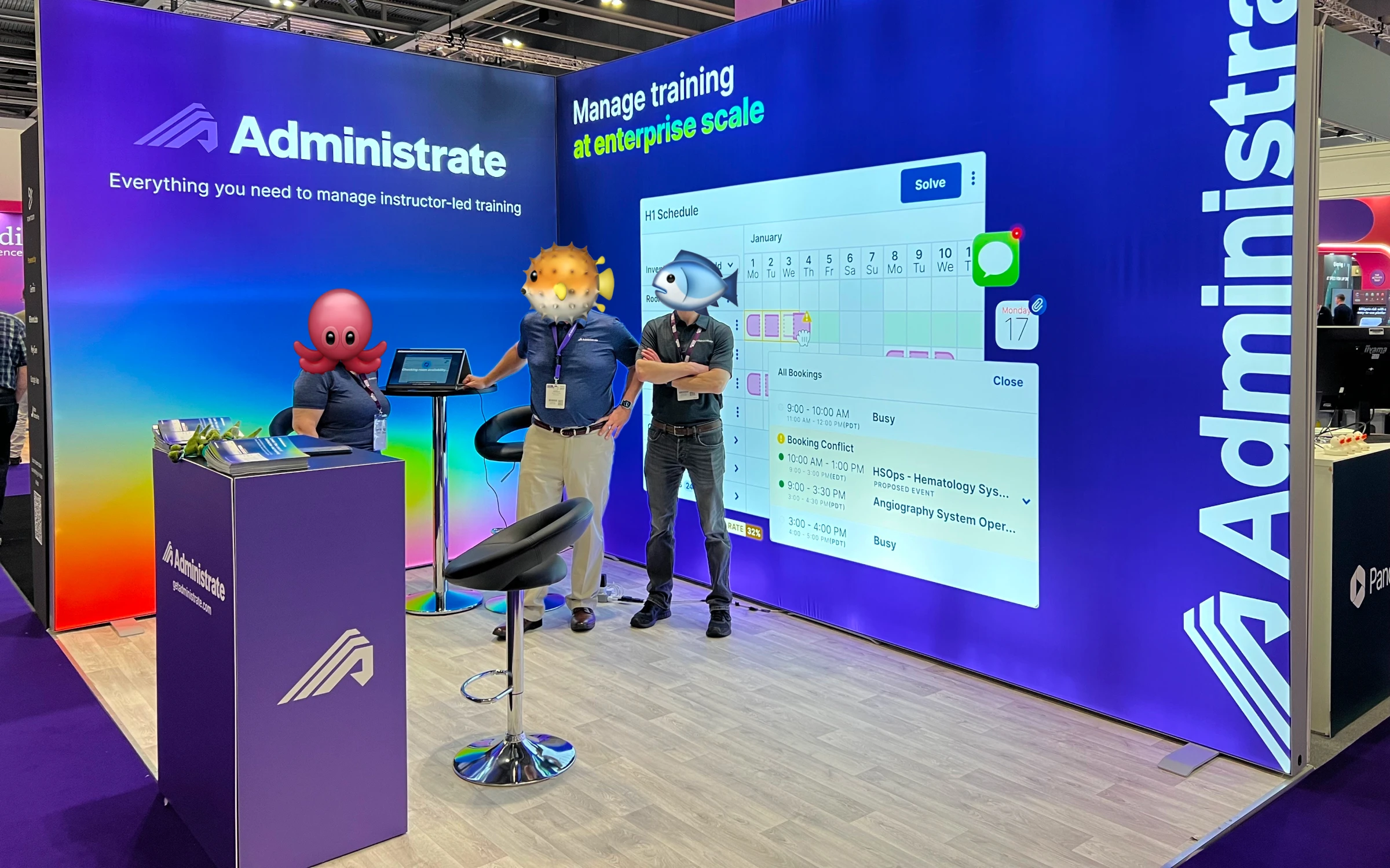
Along with the brand changes, we put time into reworking our presence at trade shows. Working closely with our content marketing director, I redesigned our entire live event experience, from the swag and brand activation activities to a brand new, modular light-up booth that could be adapted to different floorplans.
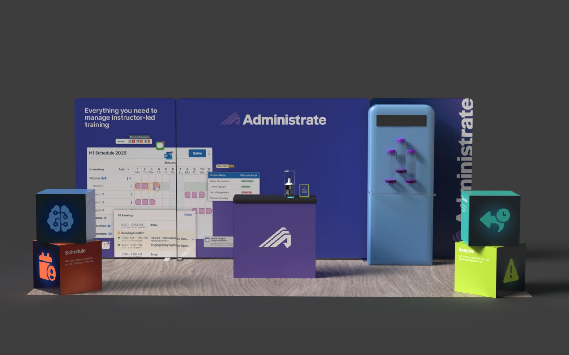
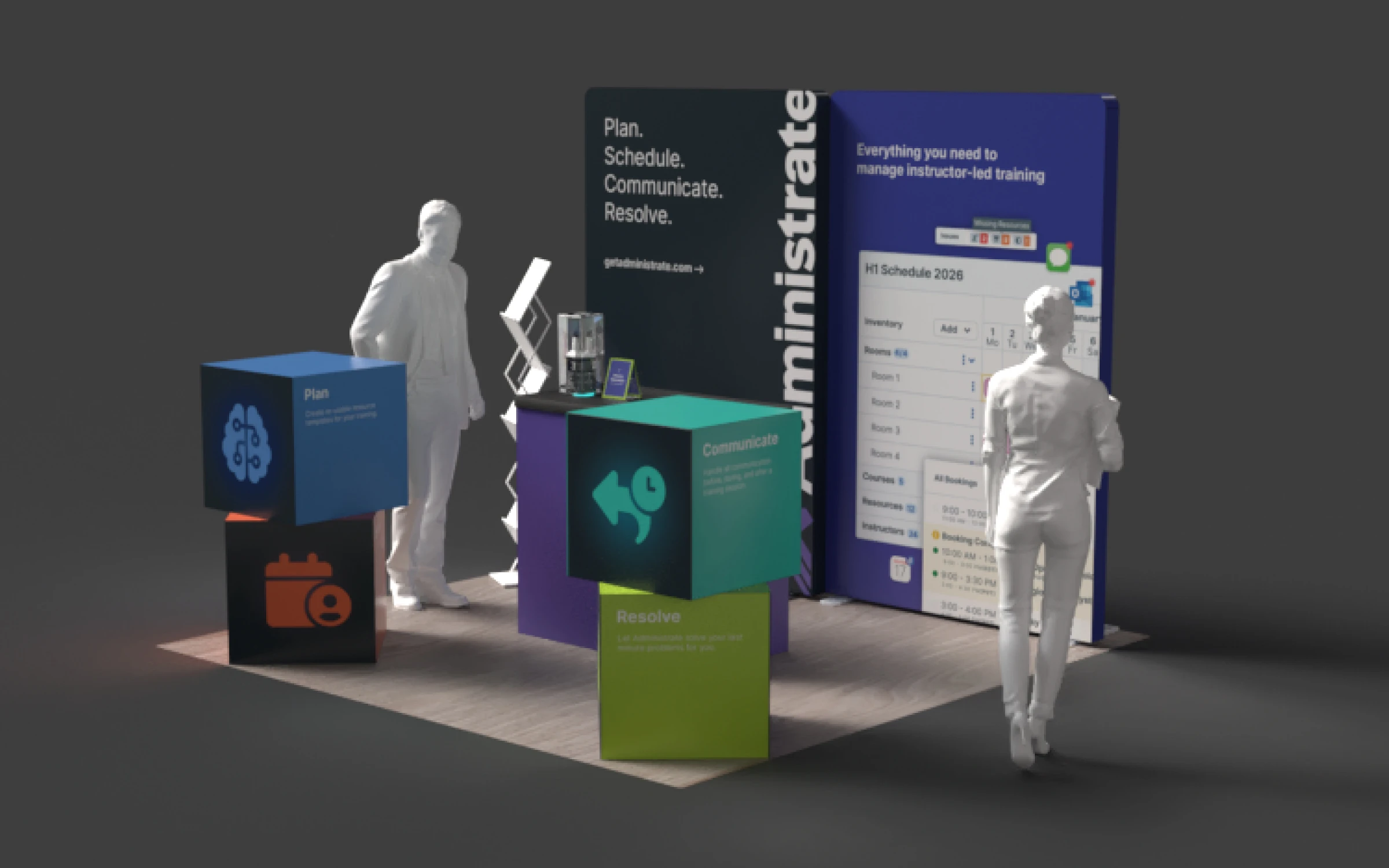
I sourced high-quality, purple stuffed “Hairy Coos” as a giveaway — a nod to our company’s Scottish roots — and tested different ways of incorporating our brand on them. Several friends and I even personally tied and cut ribbons in order to make this happen. No friendships were harmed in the process.
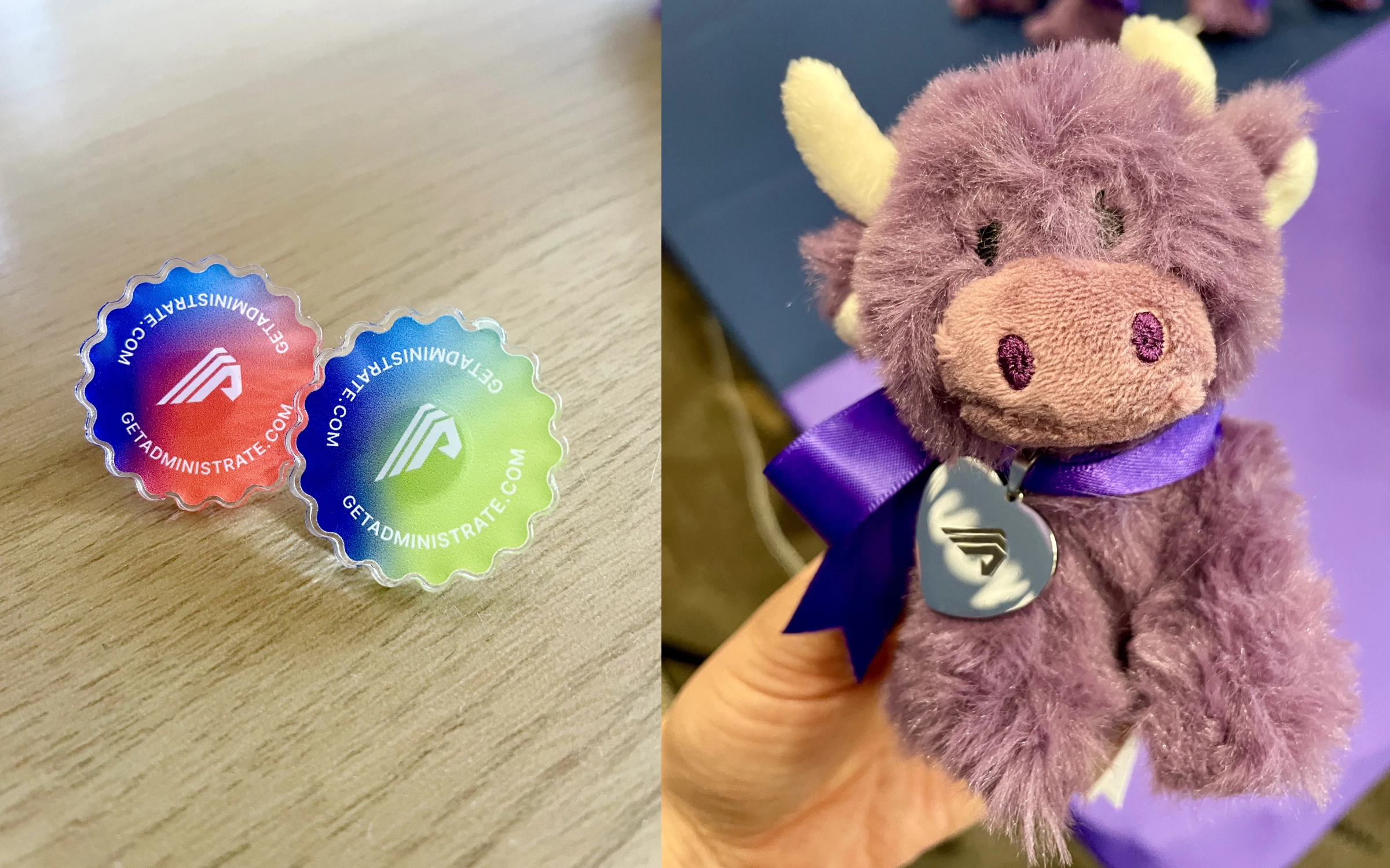
Pins and highland cow stuffed animal for drawing people to the booth.
Advertising
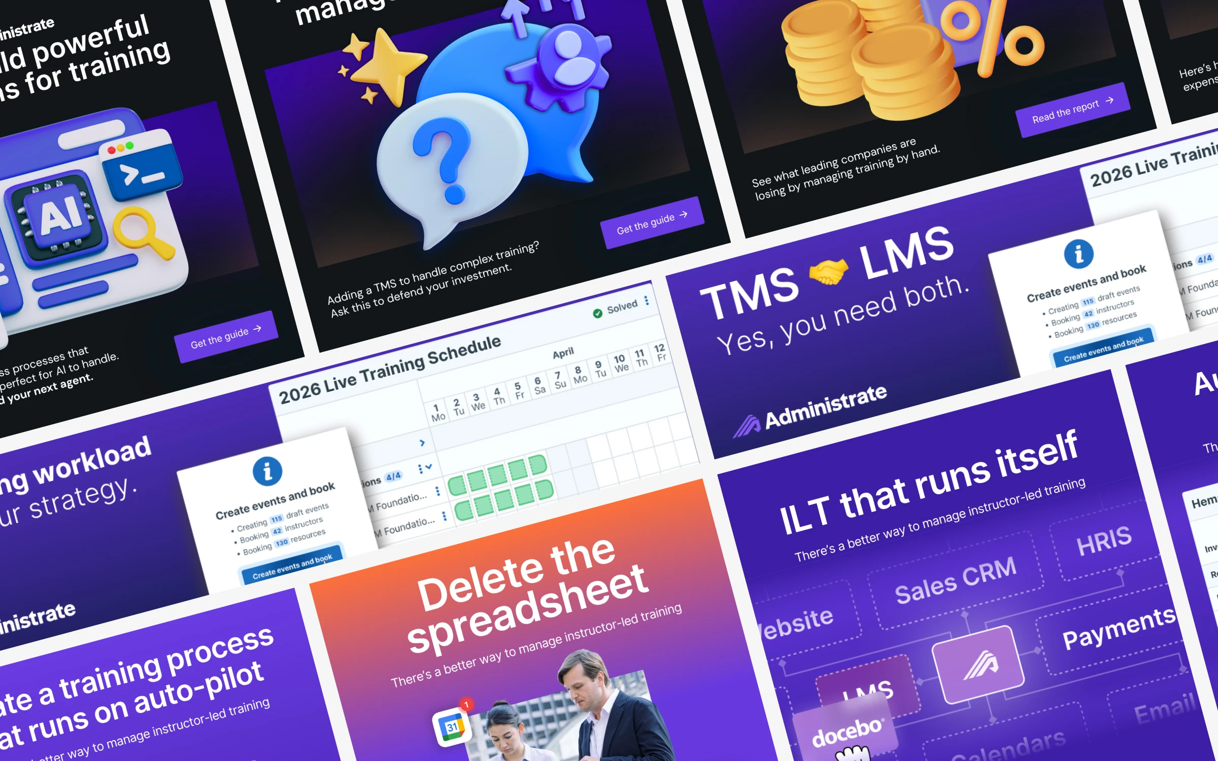
The brand extends into a flexible ad system across the whole funnel, from thought leadership to direct-to-demo. Each format uses the same type, color, and layout rules, so the ads read as one brand whether they’re selling an idea or the product itself.
“Alex has led the organization through a dramatic branding change, taking us from SMB to enterprise focused … She approaches problems with a data-driven mindset and can remain focused on the most insidious details while keeping large goals as her north star.”
— Rob Walz, Content Marketing Director at Administrate
Results
Detailed guidelines and instructions played a pivotal role in ensuring consistency and adoption. I provided the Administrate team updated email signatures, branded polo shirts, social media templates, advertisements, new swag, and trade show booth assets.
A cohesive brand has been positive for Administrate. Trade show staff and sales leaders have reported higher rates of recognition from attendees, and significantly increased foot traffic. The company has gained traction in North American enterprise market both from partners and new customers.

