
Background
When I joined Administrate in 2021, the marketing website was dated and generic. Online forms, a critical way for prospects to book time with our Sales team, were missing basic usability conventions. The visual design of the website was an essentially untouched WordPress theme with playful, organic shapes. The approach didn’t match the market that Administrate was aiming to win over. The website had been built up without a consistent design hand on it, and, despite having been recently updated by an agency, already looked like a poor fit.
I was primarily hired for my background in user experience and web design. So, rather than refreshing the cosmetics of the site, I focused on going back to basics and establishing a solid foundation. Consistent patterns, adherence to web interaction best practices, and clearer architecture could actively guide prospects through their buying journey.
This case study covers the UX and visual design work across five years. A technical rebuild is covered separately.
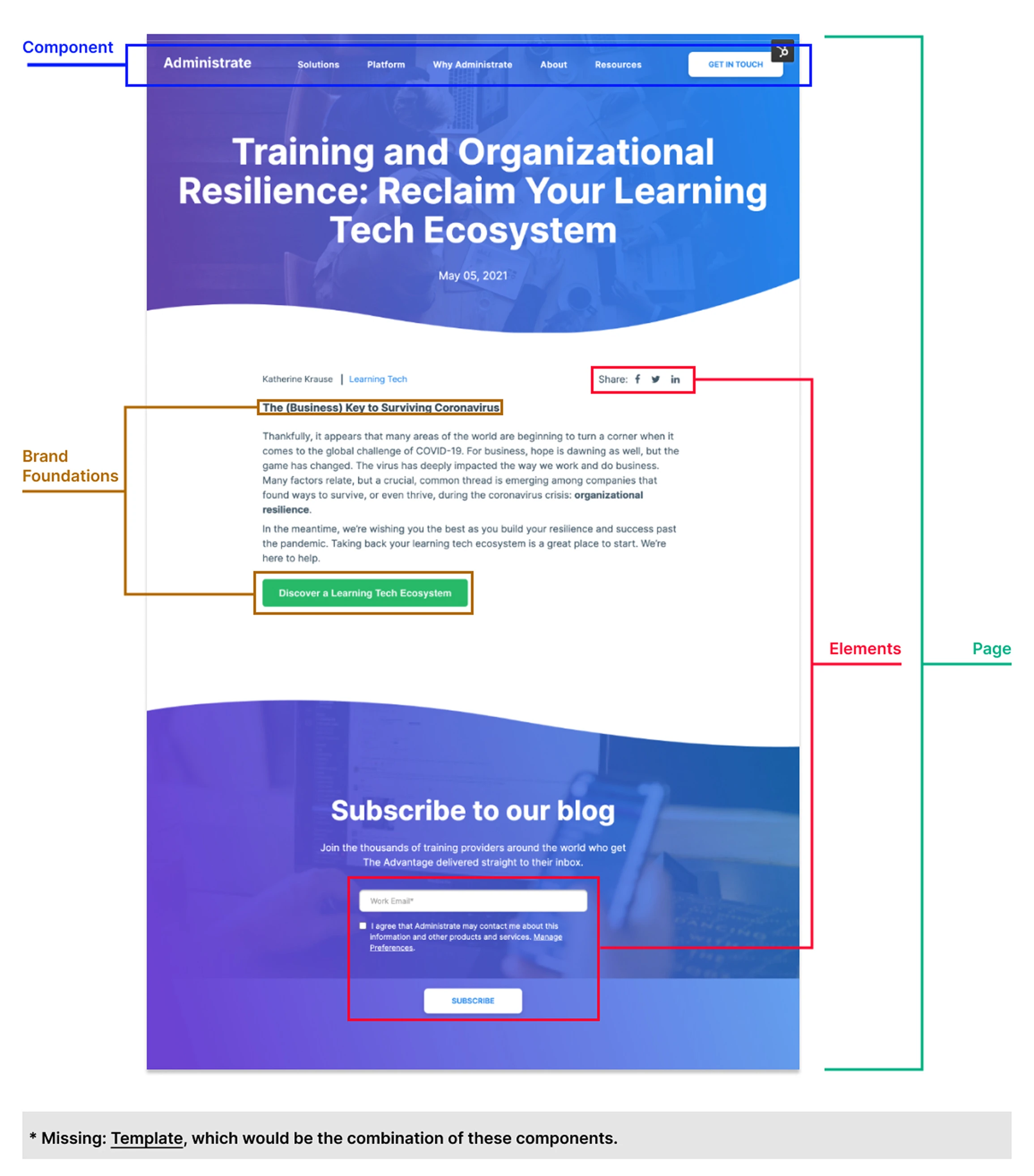
Simple diagram used for educating my team at the time about interactive design language, overlaid on a surviving screenshot of the site as it used to be.
Where we started
The site had three overlapping design problems.
1. Poor form design
The website is one of the core ways in which the company gains new leads, but the lack of care and attention paid to forms in particular could easily create frustration and confusion on the part of valuable prospects.
Input fields used placeholder text only and no labels; fields were laid out side by side regardless of their relationship to each other; required versus optional fields surfaced only after submission; and there was no accessibility support for keyboard navigation or color contrast. The website’s only job was to get prospects to fill out a form, but it had too much friction for even a highly motivated buyer to get through.
2. Generic visual language
Administrate is enterprise-level software for corporate training, and is particularly useful for industries with a high degree of audit and compliance needs, like healthcare or manufacturing. But you wouldn’t have known it from the website.
Very little imagery actually depicted our product. What did appear had little context. Nothing on the site communicated what the software actually looked like or felt like to use, and the sophistication of both product and target buyer was lost in a simple WordPress template and some stock images of businesspeople. For enterprise buyers doing serious tool evaluation, this was a major credibility gap.
3. Navigational indicators and systems did not have discernible patterns
As an early adopter of atomic design, I found it painful to see pages lacking in consistent patterns to assist users through the website. At the time, there wasn’t a shared template for high-converting pages. We were using both the WordPress site and HubSpot landing pages on a subdomain, and the two were diverging fast because HubSpot used its own stylesheets and content.
Moreover, there was no design thinking applied. Adding something new meant using inflexible templates and custom code.
Interaction design hygiene
The redesign took care of fundamentals: proper labels above every field rather than placeholder-only text, logical grouping of related fields, explicit required-field marking, accessible color contrast, and keyboard navigability. The dated drop-shadow aesthetic was also removed in favor of a cleaner look.
I also made other small changes to further improve how prospects feel while interacting with us in this way:
- I added the faces of our BDR and AEs to the top of every form, providing a peek into the humans who would be reaching out later.
- After a discovery meeting (ha) with our VP of Sales, I adjusted the copy to better align with our actual Sales process.
- I placed a video and an auto-scrolling logo bar next to the form, giving site visitors multiple forms of social proof above the fold.
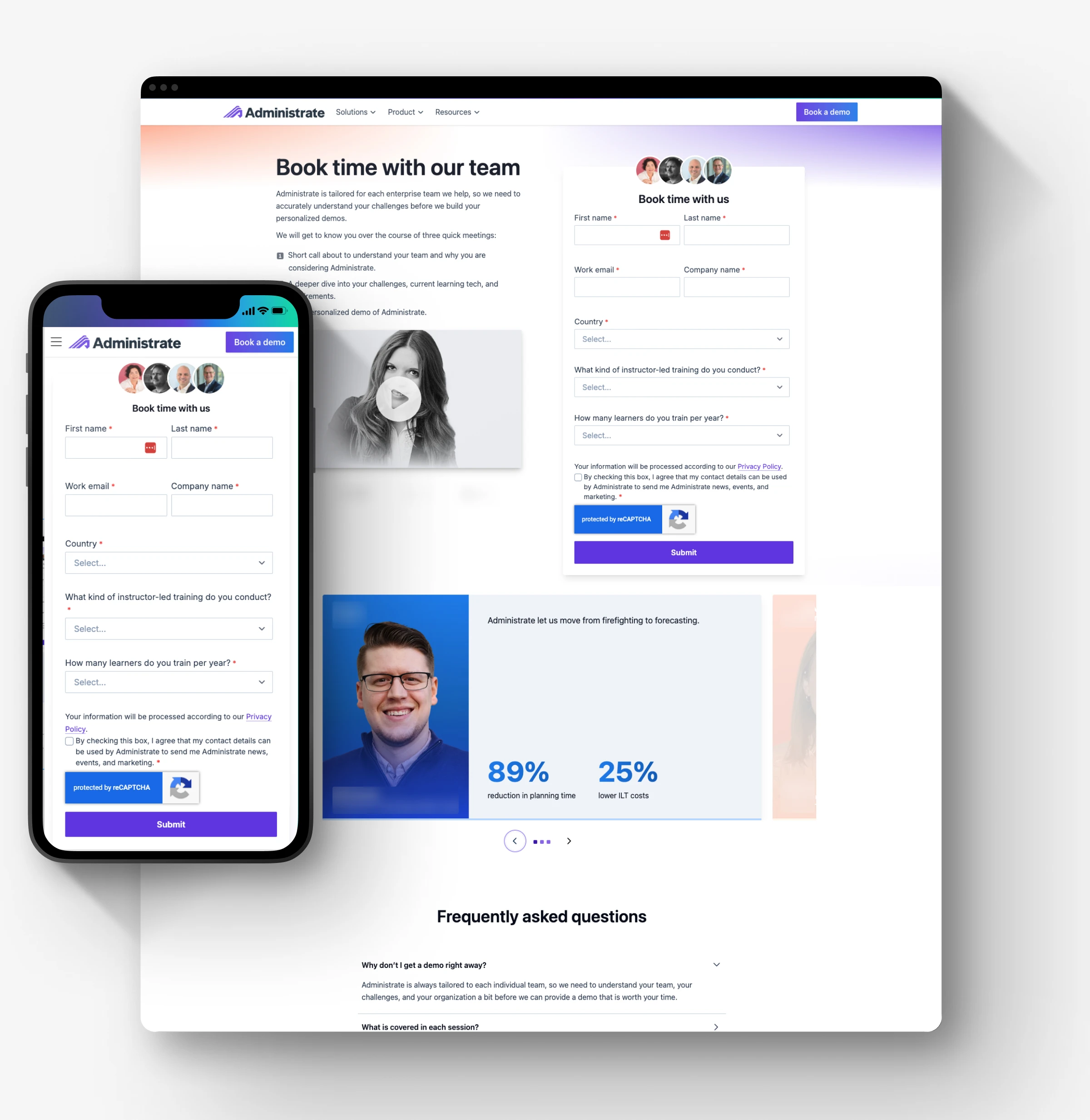
Form and content design for a high-conversion page.
Building a visual system
I applied atomic design principles throughout: defining reusable components for our developers, a template for conversion pages, and repeatable opportunities for further navigation of the site.
We now had a foundation to build on that better suited our content and business needs.
Demo flow and conversion architecture
How we handle inbound leads has changed significantly over my five years at the company, and the design of that flow has had to keep pace with how our Sales team operates.
We started with a single form. Over time, as we learned more about what made a prospect a good fit for Enterprise Sales, the flow became more sophisticated. A phone number was added, then removed when call quality didn’t justify it for enterprise. Working closely with our BDR, we redesigned the flow around qualification.
The current flow routes prospects based on fit. Those most likely to be a strong match are taken directly to a BDR calendar booking, which removes friction at the highest-value point. Prospects who need more qualification are asked targeted questions first. Those least likely to be a fit are routed differently, protecting the BDR’s time without closing the door on anyone.
Every thank-you state was also redesigned to set clear expectations: what happens next, what the prospect should prepare for, what timelines look like.
This wasn’t just a design project. It required close collaboration with Sales to understand the qualification framework, map the decision logic, and make sure the experience felt like help to the prospect rather than a filter.
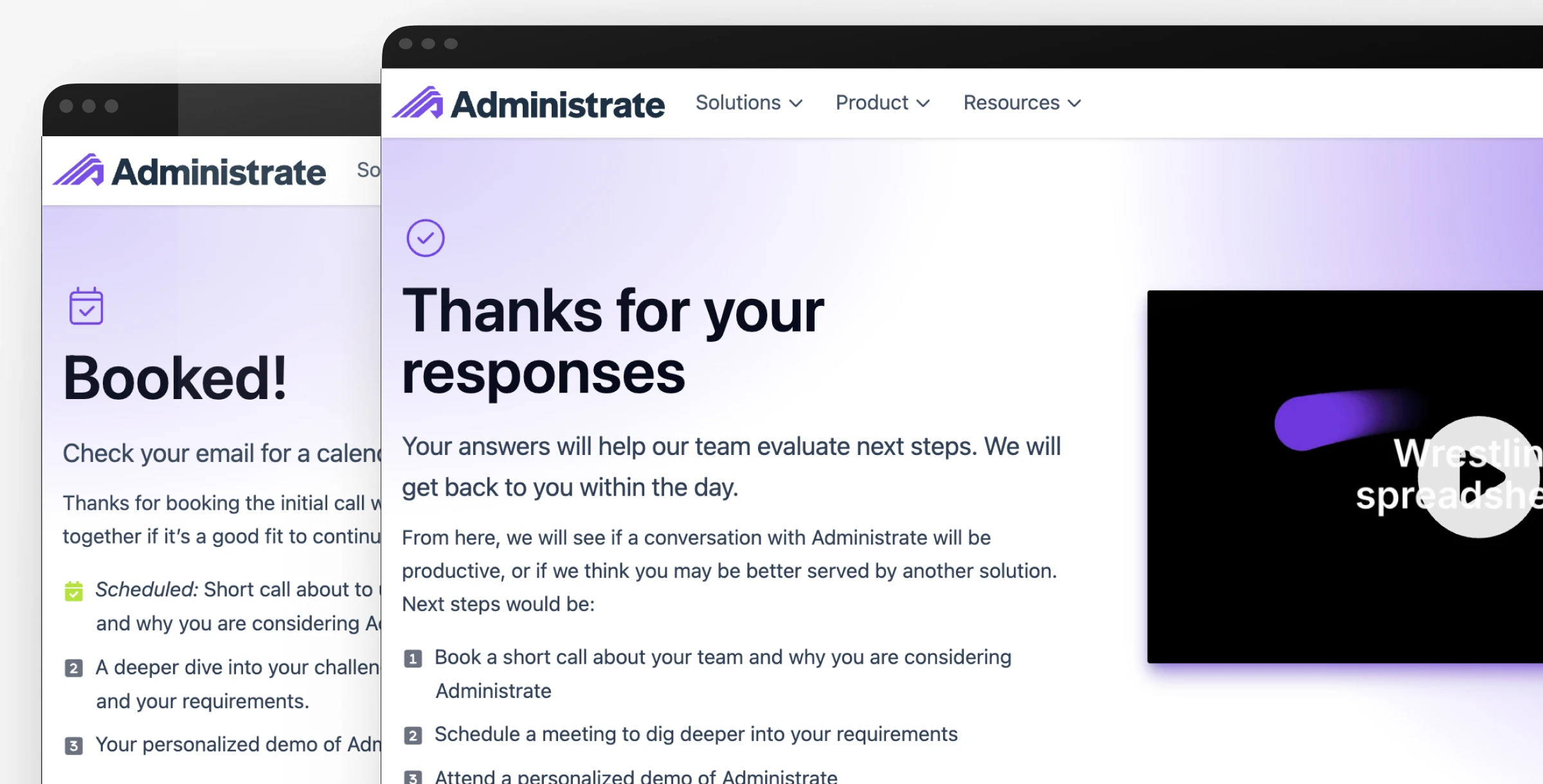
Thank-you page variants with next steps for buyers at different stages of the Sales process.
Navigation and site architecture
When I arrived, the structure was built around vague marketing pillars that buried information buyers needed to find.
In contrast, the redesign was built around the buying journey. Top-level navigation now uses “Solutions” and “Product” rather than a flat feature list, language that maps to how decision-makers at enterprise organizations think about evaluation. “Product” rather than “Features” was a deliberate choice: it signals maturity and speaks to senior stakeholders rather than hands-on users.
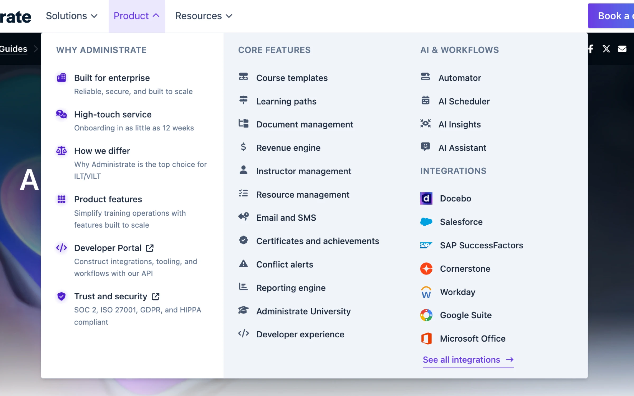
Product submenu organized to highlight AI features and integrations.
Within the mega menu, content is grouped by what it helps a buyer understand: why Administrate, core capabilities, AI and automation, integrations. House ads within the navigation surface relevant case studies and content without competing with the primary navigation structure. Customer logos are visible at a glance, so a prospect can immediately see whether companies like theirs use the product.
Breadcrumbing was added across the site to support deeper content areas (solutions pages, industry pages, feature pages) and to give users a clearer sense of where they are and how to navigate back.
Mobile was treated as a first-class concern throughout, not an afterthought.

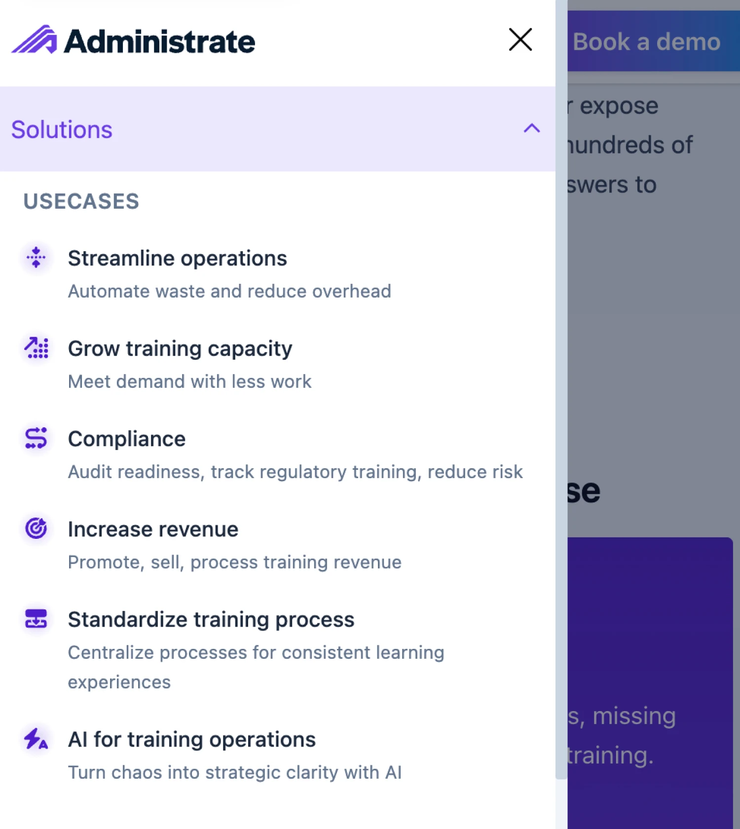
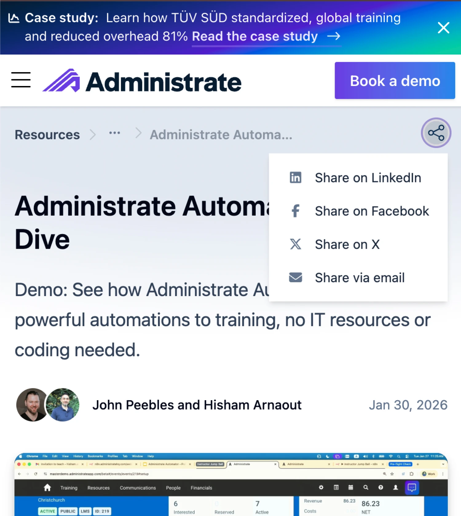
Mobile mega menu navigation.
Product storytelling and custom UI imagery
Stock imagery was never going to make a complex SaaS product feel real to an enterprise buyer. The shift to custom UI imagery was one of the more significant visual changes across the site.
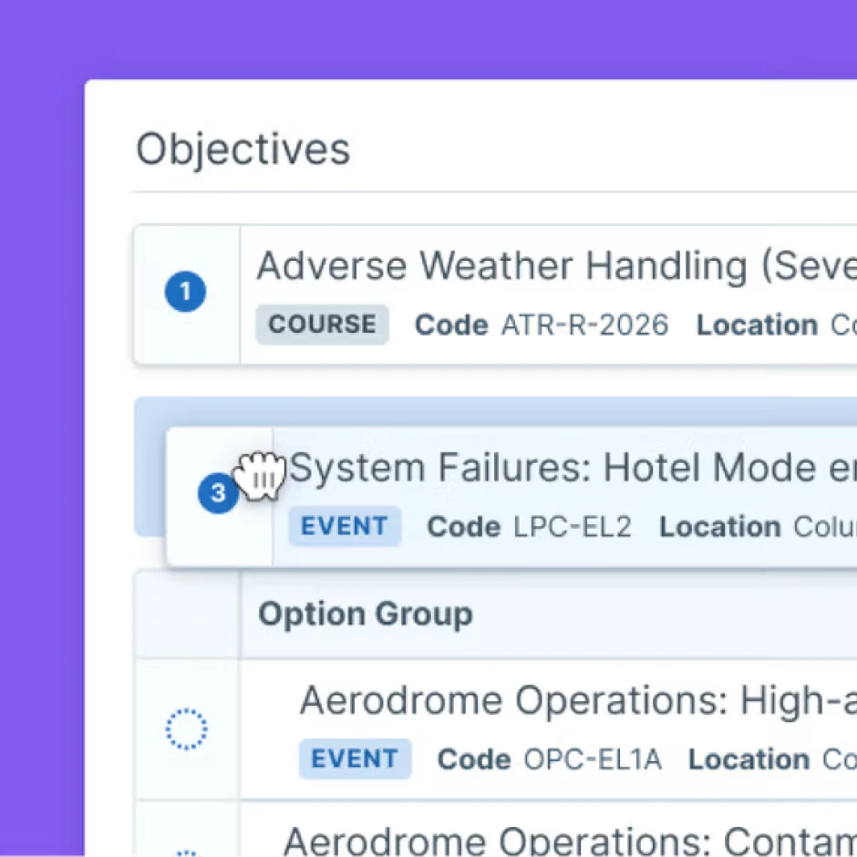
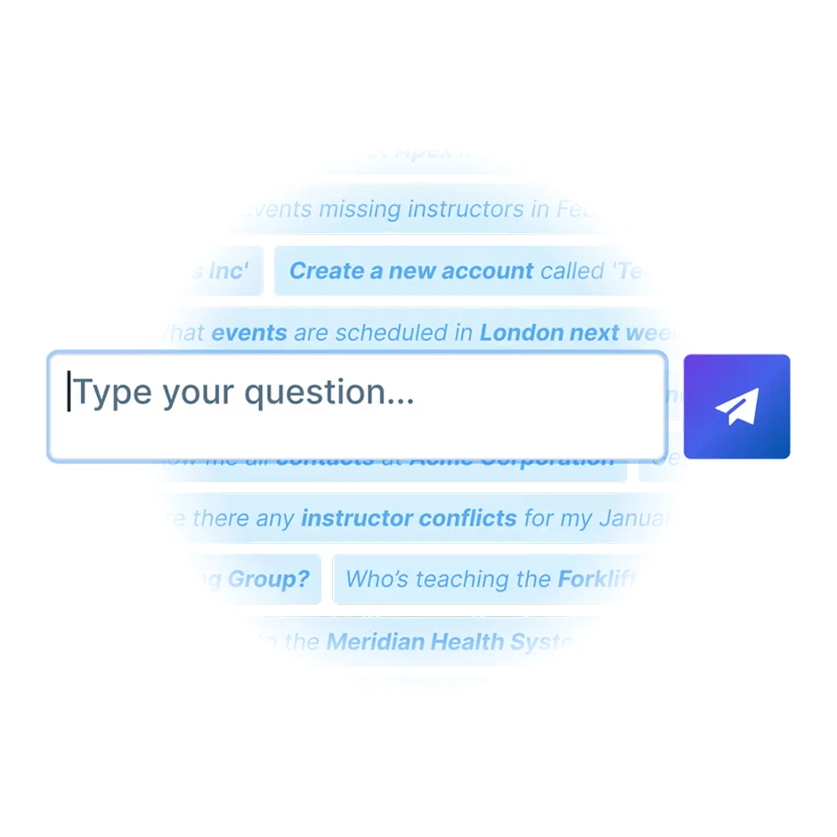
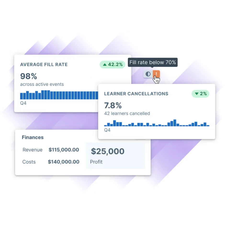
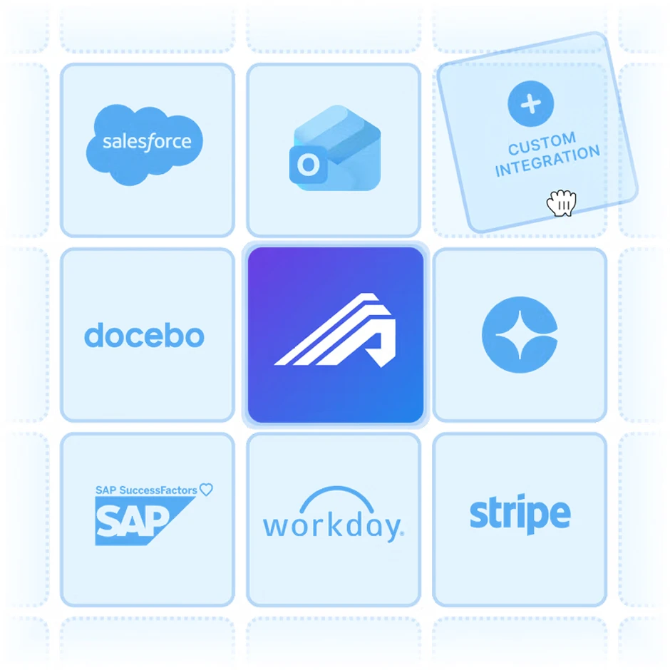
I designed a library of composite UI illustrations of product screenshots embedded in branded contexts, annotated with tooltips, and arranged to highlight specific capabilities rather than just show the interface. The goal was to make each feature feel tangible and immediately understandable, not to show the product in its entirety.
The bento grid format gave us a flexible canvas for this: colored feature cards with embedded UI snippets, each card doing a specific job. A compliance page shows a training records table with audit data. A scheduling feature card shows the instructor availability modal. A reporting card surfaces the revenue and profit data a training manager actually cares about.
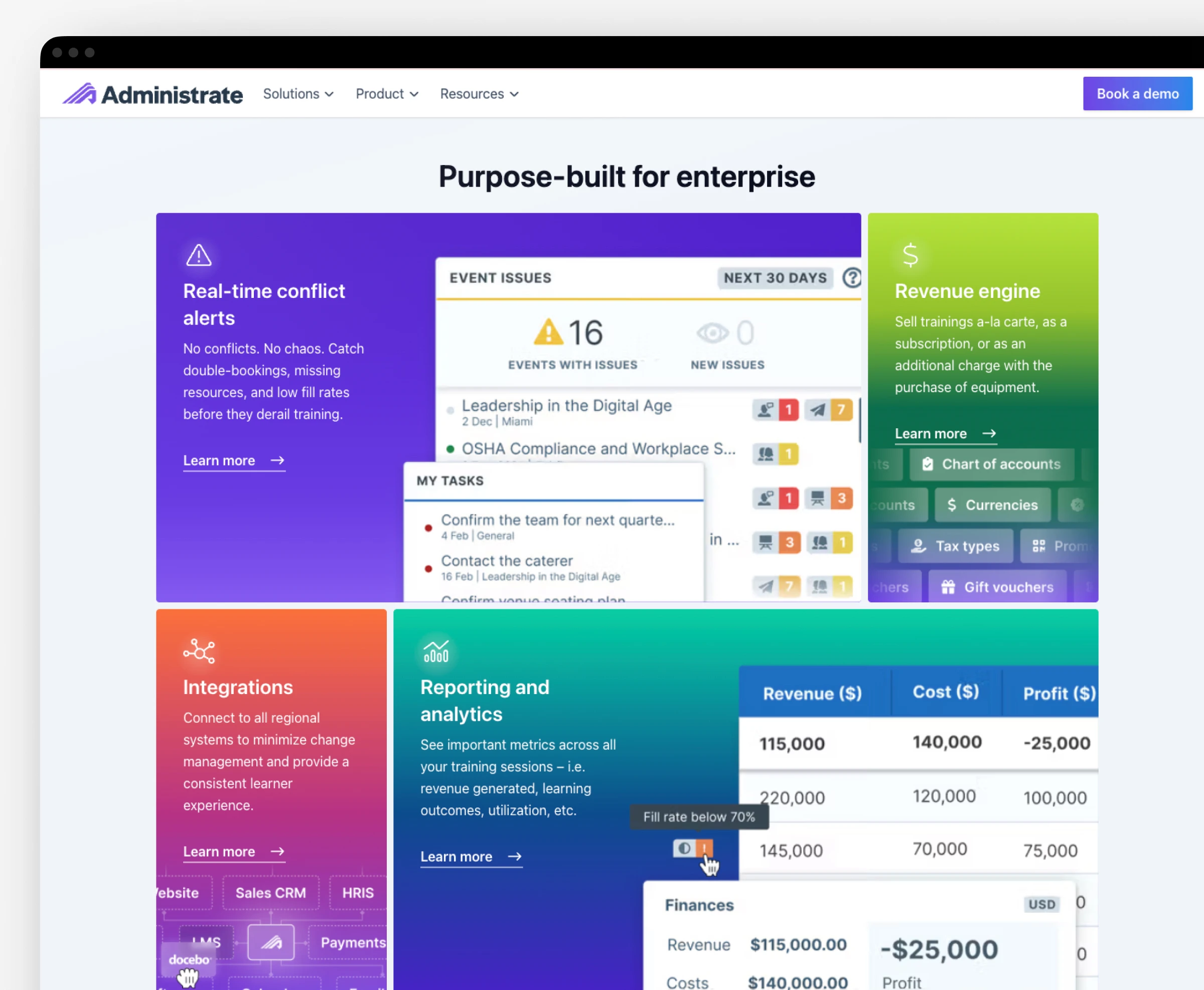
Each of these was designed in close collaboration with Product to make sure we were showing the right data, in the right context, communicating the right thing. The cross-functional work was a critical component, as marketing imagery that misrepresents the product’s functionality erodes trust.
Case study pages
When I arrived, case studies were either gated behind a form or existed only as PDFs. Neither served the goal of helping an enterprise prospect evaluate us during their research phase.
Case studies are now publicly accessible and built as digital pages with SEO/GEO value rather than document downloads. Each is structured around outcomes, and I worked with our Content Marketing Director to prioritize highlighting the statistical wins of customers using Administrate. The things a busy site visitor needs to scan quickly are highlighted and put toward the top of the page.
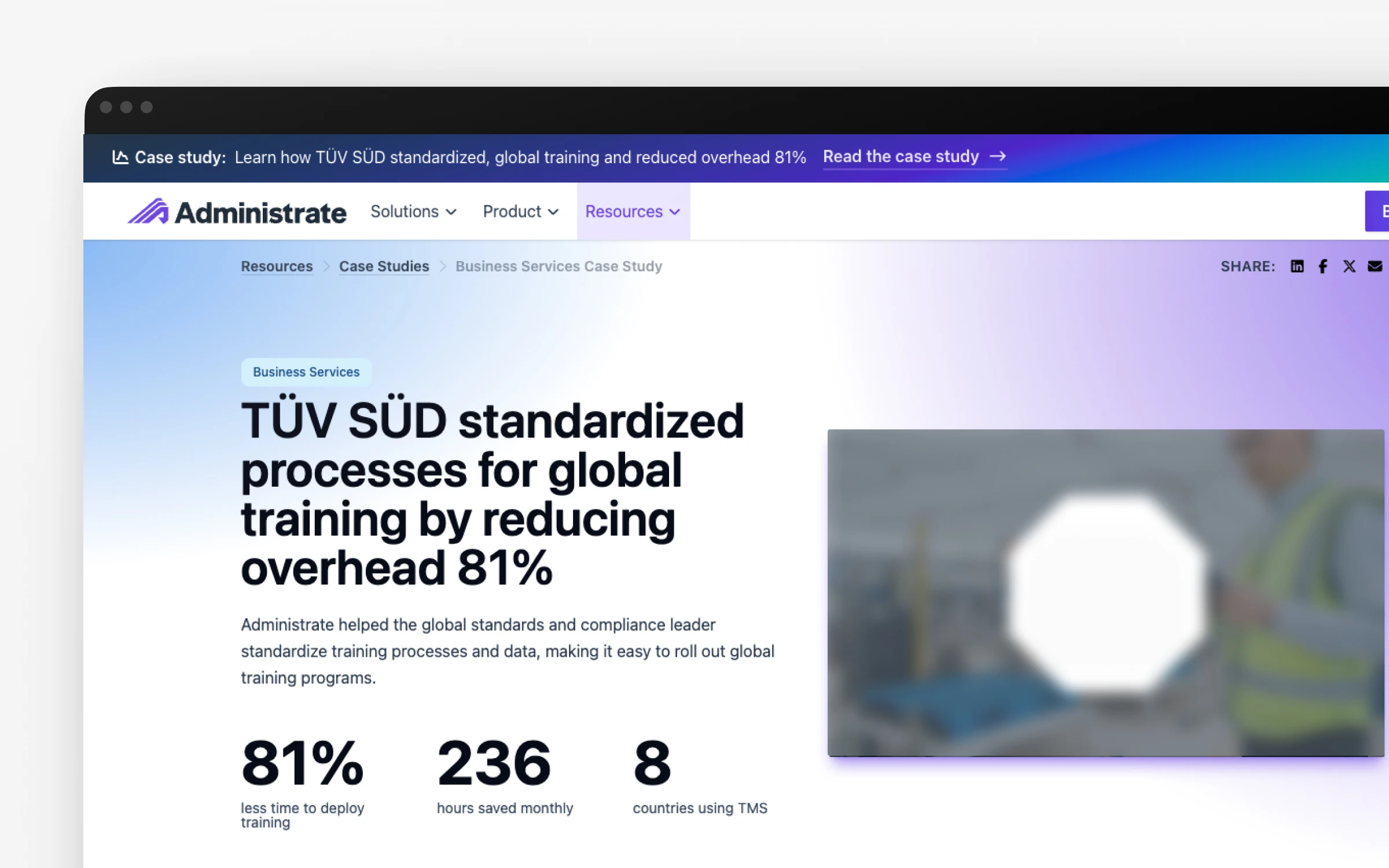
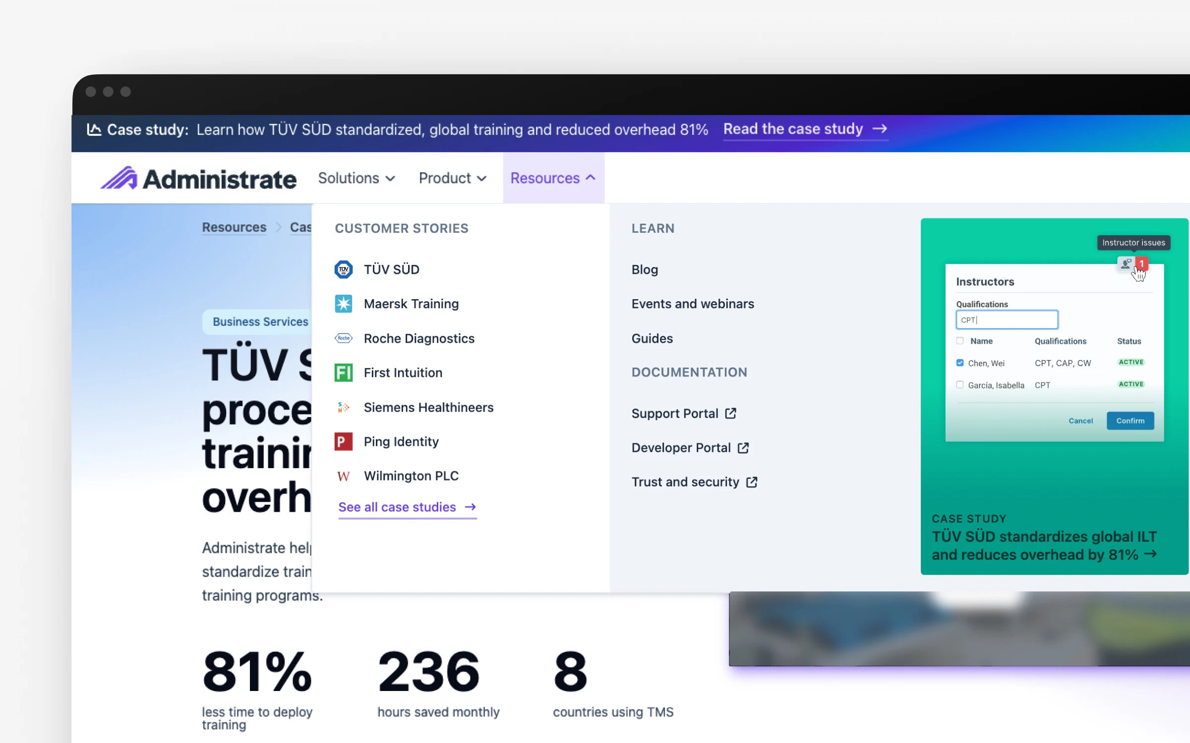
New digital case studies that are fully accessible to humans (and AI tools!)
The new approach also allowed us to highlight customer logos in an even more prominent location: our primary navigation. Other ways of highlighting these, such as site-wide banners and navigation story cards, have been useful for driving interest to new customer stories.
Results
The site that exists today is altogether different from what I inherited in 2021. It has a visual system, a clear information architecture, conversion flows designed around how enterprise buyers actually behave, and product imagery that makes the software feel real. It’s also a foundation: the technical rebuild means every future design improvement can be shipped faster and with less friction than anything we did in WordPress.
“Alex possesses that rare balance that every Marketing executive wants … She understands the functionality of design as a revenue lever and employs her skills toward business results.”
— Katherine Krause, former VP of Marketing at Administrate
