Contributions
Organization
AzaveaBackground
Temperate is a decision-support tool for climate adaptation planners. The application guides practitioners through interpreting climate data and is aimed at users who may lack a climate background and need help understanding the process. Temperate help users develop a “vulnerability assessment” for their community and offers suggestions for how to take action based on a user’s location and particular community needs.
Given our target userbase, I wanted to ensure that Temperate’s brand felt friendly and unintimidating.
Branding research
Before touching a pencil, I researched tools already in the climate space. This allowed me to get a better sense of what would make Temperate stand apart from the already fairly crowded landscape of tools. I discovered several patterns:
- Unsurprisingly, color is dominated by blue and green.
- Frequently the names of tools are fairly literal.
- Imagery typically includes environmental symbols, like leaves, sun or water.
- Marketing efforts in the space tend to focus on data as opposed to user goals.
This research was crucial in allowing me to establish a benchmark against which to develop and evaluate our product’s brand.
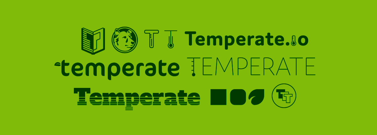
Naming our product
Once I better understood what was already out there, I felt that we could make the new product stand out with a unique, conceptual name and logomark. Using dependable blues and greens would ground the brand identity, and make it feel like it belongs alongside other tools and organizations. The team worked on developing a name and solicited ideas from all corners of the office.
Ultimately, we chose to reflect climate adaptation planning’s loftiest aspirational goal: to keep our world’s climate liveable for all of Earth’s creatures.

Temperate climates lack extremes of temperate and precipitation.
We went with the name Temperate, inspired by geographically temperate climates. Temperate climates are those without extremes of temperature and precipitation (rain and snow), which made it a perfect analogy for the goal.
Creating Temperate’s brand identity
Once we had our name, I sketched out many directions for the logomark. The name gave me a lot to stew on, but I was looking for a way to have a visual representation of our SaaS product that wouldn’t get lost in a sea of other climate tool logos. Early designs were all over the map – nothing I drew felt quite right for making our tool stand out.
Early sketches for Temperate’s logo.
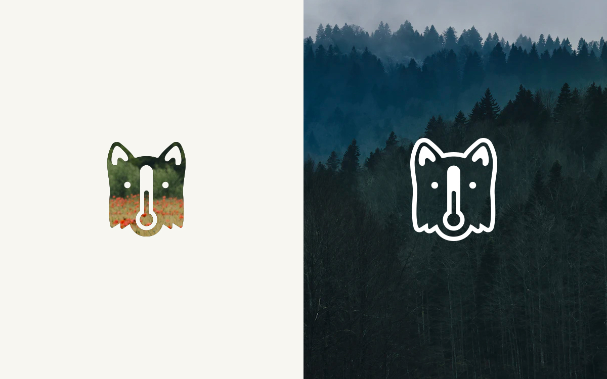
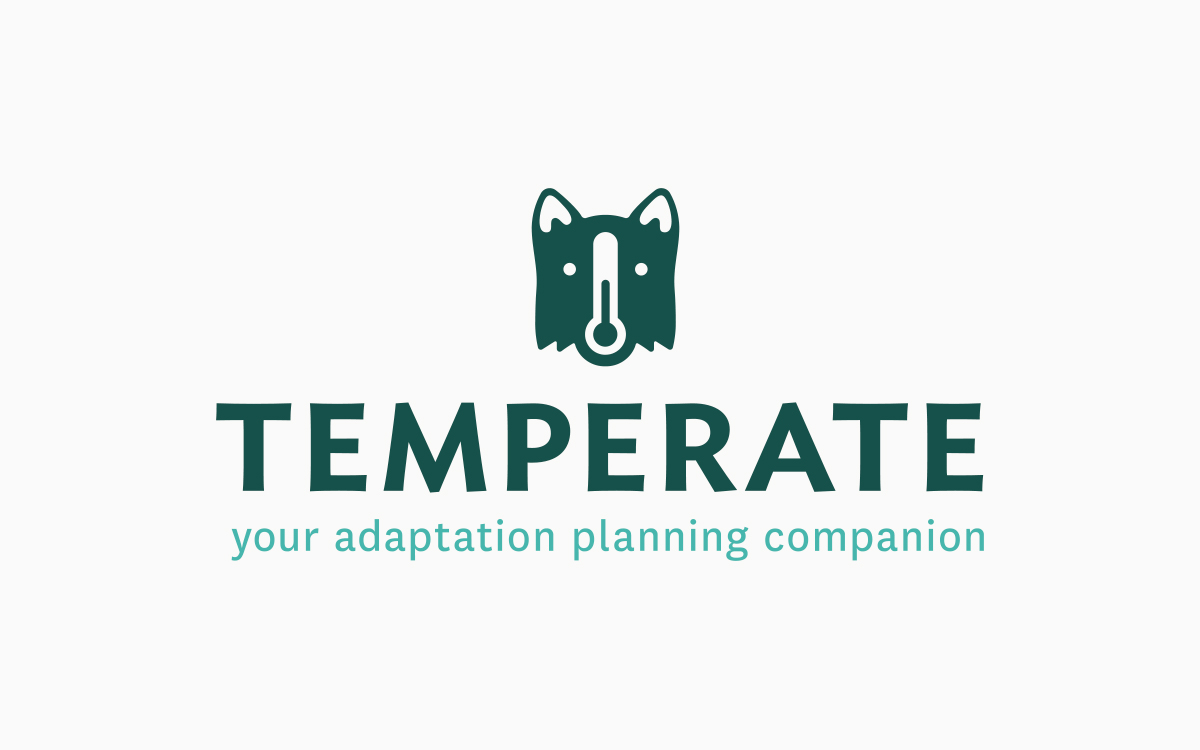
The winning direction was that which created a mascot. The mark references the collie dog breed (most notably the border collie). Known as a herding dog, the concept was that Temperate herds information and climate data all into one place. Our hope was that Temperate would become adaptation planners’ best friend in planning for climate change. Tying it together with the name, a thermometer makes up the nose of our mascot.
Applying the brand
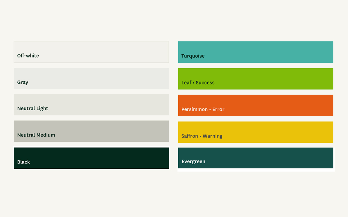
I developed a bright color palette and set the wordmark in Ideal Sans. We hoped to make Temperate continue to stand out by giving it a sleek but unintimidating, human look. The typeface being used throughout the application is Klim Foundry’s National.
The application itself retains the bright energy of the brand. As our target users were folks tasked with planning for climate change, but likely without a background in interpreting climate data, I wanted to ensure that the interface was inviting, friendly, and unintimidating.
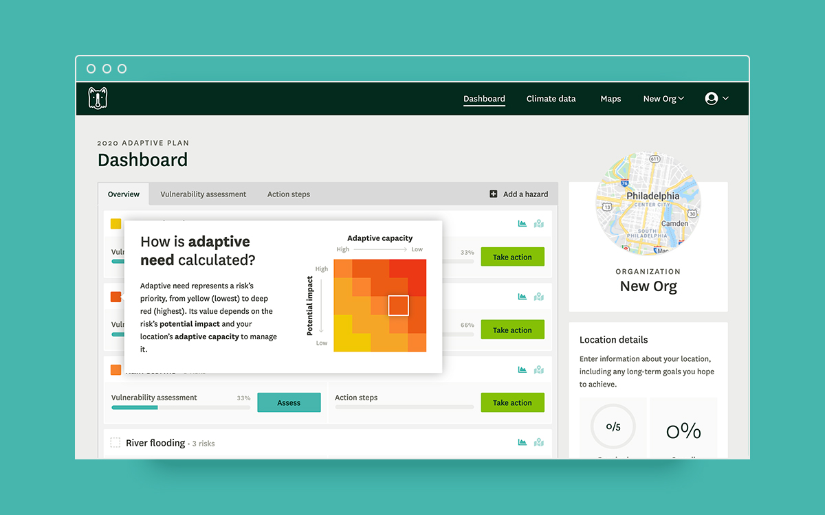
The brand applied to various screens in the application.
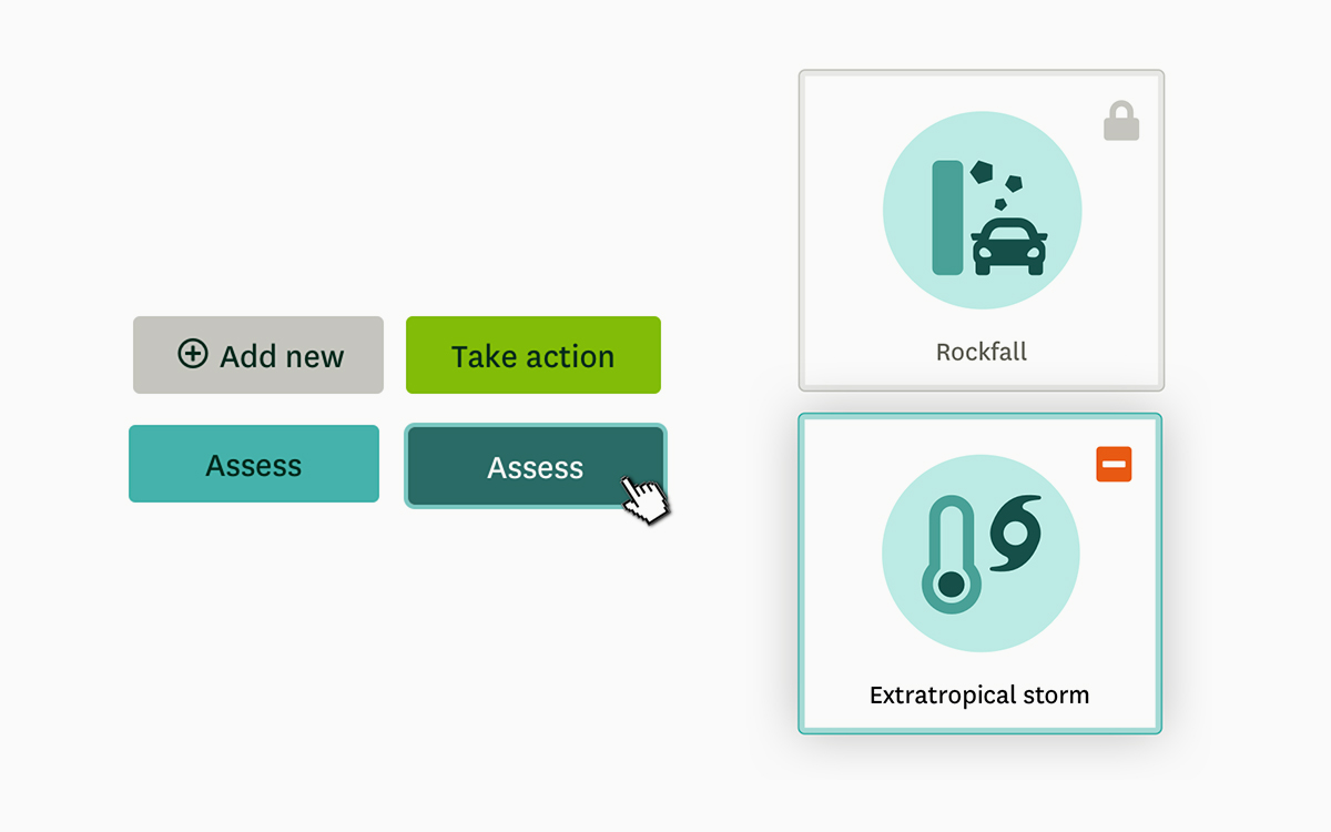
To assist with quick recognition of frequently dense terminology, I developed custom iconography to represent the various hazards, community systems, and types of policies that could appear in Temperate. While users would be unlikely to recognize these oftentimes complex concepts by the iconography alone, they assist with quicker recognition and add an element of polish.
Custom iconography, largely designed by extending Font Awesome iconography.
Check out the final product by creating a free account or learn more about the branding process from the blog post I wrote for Azavea.